How To Design A More Eye-Catching Magazine Spread
Jul 29th, 2019 by IssuuThe magazine format sets it comfortably apart from other media formats. The combination of illustration, text, content, and color give each spread an unlimited amount of creative potential. But the most important part of any magazine, where the designer’s creative prowess can really shine, is the double-page spread. You are the artist, and the spread is your canvas. It should be eye-catching, provocative, and should make turning the page irresistible for the reader. Here are some ways to make a better magazine spread.
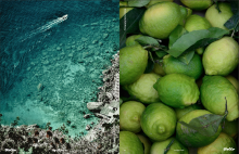
Color Blocking
This is one of the more straightforward ones that nonetheless never ceases look great. By juxtaposing contrasting blocks of color and using secondary colors for text, you can achieve a visually striking composition. By using the full extent of the spread, you can tell powerful stories through little more than color on a page. Here are some examples.
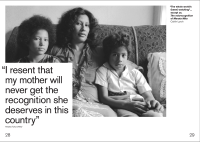
Quote BIG
Many stories are about people with something to say. If that’s the case, why not make what they have to say as visible as possible? Obviously, it’s still important to be clear in your writing in order to stay true to the message at hand. But if it’s possible to condense that message or at least a part of it, why not let it make it loud? The best way to do this is by using those spreads to display the best quotes in a creative manner. Need some inspiration? Here’s how we like to see it done.
Related Reading: Creating custom advertorial content
Go minimalist or maximalist, but no half-measures
If you’ve spent any time flipping through magazines, you’ll probably have noticed that designers tend to sway in one of two directions. Either they go minimalist, favoring white space, simple typography, and quiet photos, or they go maximalist, where loud colors, big fonts, and eye-catching headlines reign. We’re fans of both styles, and if you’re having trouble giving your spread an interesting design, we recommend leaning into one of the styles. Choosing whether to strip down or build up your spread can help push you in a specific creative direction. Here are some great examples.

Think Vertically
This is one that hasn’t been used all too much in publishing, mainly because it’s so out-of-the-box in terms of magazine design. Vertically-aligned spreads have one big disadvantage: they require active reorientation on the part of the reader. But, on the other hand, they provide immense opportunity to emphasize height, or display infographics differently, or highlight vertically-oriented photography in more glory.
Use these ideas like your personal layout toolbox—reach in when you need to, use them individually or in tandem, and above all, have fun with it. Let these ideas encourage you to reach new heights with your design.